Conlang Random Thread
-
rotting bones
- Posts: 3306
- Joined: Tue Dec 04, 2018 5:16 pm
-
rotting bones
- Posts: 3306
- Joined: Tue Dec 04, 2018 5:16 pm
Re: Conlang Random Thread
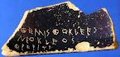
Given their sudden advance in technology, there are reasons to think they might have skipped some stages between inscriptions and the ballpoint pen. However, I do want to create other styles. Let's just say I don't know of other styles I'm ready to share yet.sasasha wrote: ↑Sat Sep 26, 2026 5:39 pm I do think there are a bunch of writing implements that would manage something like this beyond those bradrn mentioned: pencils, styluses in wax(?) or perhaps, depending on the leaf, on leaves... And perhaps this form of Laulai is written with flexible metal nibs or ballpoint pens, after all. Just because this version has been shared, it doesn’t mean there isn’t a stylistic development implied as existing over time to this point and supported by technical development.
Good idea. I will experiment.sasasha wrote: ↑Sat Sep 26, 2026 5:39 pm But I agree with bradrn that you could experiment with different styles. Specifically, maybe try different approaches to letter joining and overall character alignment (which is currently quite ‘italic’, FWOABW). You wanted a flickering flames vibe: maybe characters don’t have to join as often, or join differently, and then you might be able to achieve some more heliacal shapes that might look even more like flames? I particularly like that some letters are multi-part and require two strokes: if a single letter can be like this, perhaps some letters don’t need to join, either?
You are right. There are more forms than I have shown here. There are even a few glyphs that are effectively heterograms for sacred nouns and for word endings in formal calligraphy. The heterograms originated from Greek spellings that are nevertheless pronounced as Laulai words (like in Pahlavi).
I once read a book called the Candle of Vision, which associates mystical insight with mental fire. However, it takes an artistic rather than mathematical approach: https://sacred-texts.com/neu/celt/cov/index.htm
In world: Pythagoreans have worshipped the sun since ancient times. The Laulai have a lot of solar imagery. Their capital is Heliopolis. The reach of the understanding (sorm) is symbolized as El (Helios), the fire of the intellect.
(The name Heliopolis is in Greek, but it's pronounced with a Laulai accent, such as El-pols.)
I agree with this observation. I was thinking that because they are rare sounds, they were originally written as plain <P> and <D>. Then one day a scribe decided to add a circle to differentiate them. When this script was used for rock-cut inscriptions and metal plaques, the circle turned into <> to make it easier to inscribe. However, it still occasionally appears as a circle depending on the style and how large the inscription is. If the form is old-fashioned enough, the <> might be dropped altogether and written as <P> and <D>.
I have thought for hours without coming to a final conclusion. Thanks for giving me something to think about.sasasha wrote: ↑Sat Sep 26, 2026 5:39 pm Two elements of the inscription form strike me as a bit unlikely: the consecutive short vertical dashes and the elements that resemble <>. They’re both quite small details that seem unlikely to scale well as they are. The dashes I would be tempted to rotate individually so they are both diagonal and thus not sitting end-to-end. ... I personally feel the mark that distinguishes ⟨S T⟩ from ⟨Š Č⟩ and ⟨P D⟩ from ⟨B Ð⟩ might as well be the same, and, whilst I hear your comment that this script can be pretty ornamental due to, let’s call them, “socioscriptorial factors”, probably could be simplified. Otherwise I really like this.
Edit: I realise I didn’t pick on ⟨K G⟩ in the same way; oddly I like ⟨G⟩, to me the glyph the modifier sits on is simpler and more harmonious to the modifier itself. Something to ponder.
...
Edit 2: I agree with Qwynegold about the leaning ⟨p⟩.
It originated in the Eastern Roman world and then diverged for 14 centuries. I wonder whether Syriac writing in Kerala evolved major stylistic differences.sasasha wrote: ↑Sat Sep 26, 2026 5:39 pm Re the cursive version again, I’m not personally bothered by the multi-height vibe. I think it could be a feature. At the moment your example looks quite inspired by cursive Latin and Cyrillic hands; the overall resemblance is quite strong due to the joining strategies and italic-like alignment, thus the vertical variance is potentially a bit jarring in being the only particularly ‘non-Western’-looking element. If you reduced this resemblance a little, the multi-height thing might not stick out so much.
Just a couple of ideas, again.
Re: Conlang Random Thread
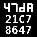
Making slow progress on the sexagesimal number system for one of my projects. Inspired by my research on larger numbers in other languages, I have been experimenting with how my own conlang might derive higher orders of magnitude. The general idea is that the first six powers of sixty derive from practical and concrete roots: bundles, sacks, crates, caravans, ships, and warehouses. The next three powers derive their roots from metaphors for great magnitude: abundance, mountain peaks, and the edge of the known world. The last three powers derive their roots from more abstract analogs of the previous: diverse, extreme, and final. Undoubtedly these are quite rare in practice and only added for an even dozen orders of magnitude.
Intelligentia artificiālis dēlenda est.
Idiot America | He/him
Idiot America | He/him