Page 41 of 180
Re: Conlang Random Thread
Posted: Tue Aug 06, 2019 9:36 pm
by bradrn
malloc wrote: ↑Tue Aug 06, 2019 8:06 pm
It seems remarkably difficult for me to devise a conscript that follows the featural principle like hangul that also feels aesthetically satisfying. Expressing the phonemic features as transparently as possible results in something awkward and repetitive, particularly since not all shapes combine equally well with diacritics. Yet focusing on aesthetics obscures the featural components or complicates their mechanics to the point that the script hardly feels featural anymore.
Could you give some examples of particular points you’re struggling with? Maybe you could include some images too so we can see the aesthetic problems.
Re: Conlang Random Thread
Posted: Tue Aug 06, 2019 11:50 pm
by Moose-tache
The naturalistic thing would be to go with the more aesthetic/practical option, and let the featural properties be a background. The "featural" properties of Hangeul are so subtle that many people (like myself) are convinced that they were made up after the fact. In general I think featural scripts look a bit artificial and amateur, like a verbal paradigm where five tenses are indicated regularly with one of five vowels or something. But maybe you're going for an artificial vibe. Do you have a sample for us?
Re: Conlang Random Thread
Posted: Wed Aug 07, 2019 8:37 am
by malloc

- decon_redscript_sample.png (3.05 KiB) Viewed 13171 times
Here is one sample of my attempt to implement featural writing. Every element expresses some phonological feature with the arrangement of these elements in the block also having featural significance. The sheer level of discontinuity bugs me since it renders pretty much every line free-floating (although the script Masako posted somehow manages to make discontinuous glyphs look nice). Handwriting the script legibly is also difficult since it requires lifting the pen so much, distinguishing straight lines from those with cornered ends, and so forth.
The previous script that I posted is also theoretically featural, but the handling of features is considerably more abstract and opaque. Thus two characters may differ only in the sonorance of their onsets but look considerably different because the elements are rearranged and warped in complicated ways.
Re: Conlang Random Thread
Posted: Wed Aug 07, 2019 4:00 pm
by Znex
malloc wrote: ↑Wed Aug 07, 2019 8:37 am
decon_redscript_sample.png
Here is one sample of my attempt to implement featural writing. Every element expresses some phonological feature with the arrangement of these elements in the block also having featural significance. The sheer level of discontinuity bugs me since it renders pretty much every line free-floating (although the script Masako posted somehow manages to make discontinuous glyphs look nice). Handwriting the script legibly is also difficult since it requires lifting the pen so much, distinguishing straight lines from those with cornered ends, and so forth.
The previous script that I posted is also theoretically featural, but the handling of features is considerably more abstract and opaque. Thus two characters may differ only in the sonorance of their onsets but look considerably different because the elements are rearranged and warped in complicated ways.
That looks really nice to me already actually! The discontinuous characters don't seem very different from how Chinese script works, honestly.
For how to handwrite such characters, I recommend you look up semi-cursive and
cursive Chinese scripts: these often join up and simplify discontinuous patterns in opaque but memorable ways. Japanese hiragana and katakana are both derived from cursive Chinese script for instance.
Re: Conlang Random Thread
Posted: Thu Aug 08, 2019 7:48 am
by bradrn
malloc wrote: ↑Wed Aug 07, 2019 8:37 am
The sheer level of discontinuity bugs me since it renders pretty much every line free-floating (although the script Masako posted somehow manages to make discontinuous glyphs look nice).
Completely agree with Znex: this script is lovely already! I don’t even notice the discontinuities really, they just fit so well into the overall aesthetic…
Handwriting the script legibly is also difficult since it requires lifting the pen so much, distinguishing straight lines from those with cornered ends, and so forth.
Not at all: I tried handwriting your sample with both a pencil (which copes fine with discontinuities) and a fountain pen (which doesn’t), and found it really easy to write with either tool. On the other hand, you could use Znex’s suggestion and create a formalised calligraphic style à la Chinese.
Re: Conlang Random Thread
Posted: Fri Aug 09, 2019 4:53 pm
by doctor shark
A while ago, I made some money. Now that step one of thesis doom is out of the way, I figured sharing was in order.
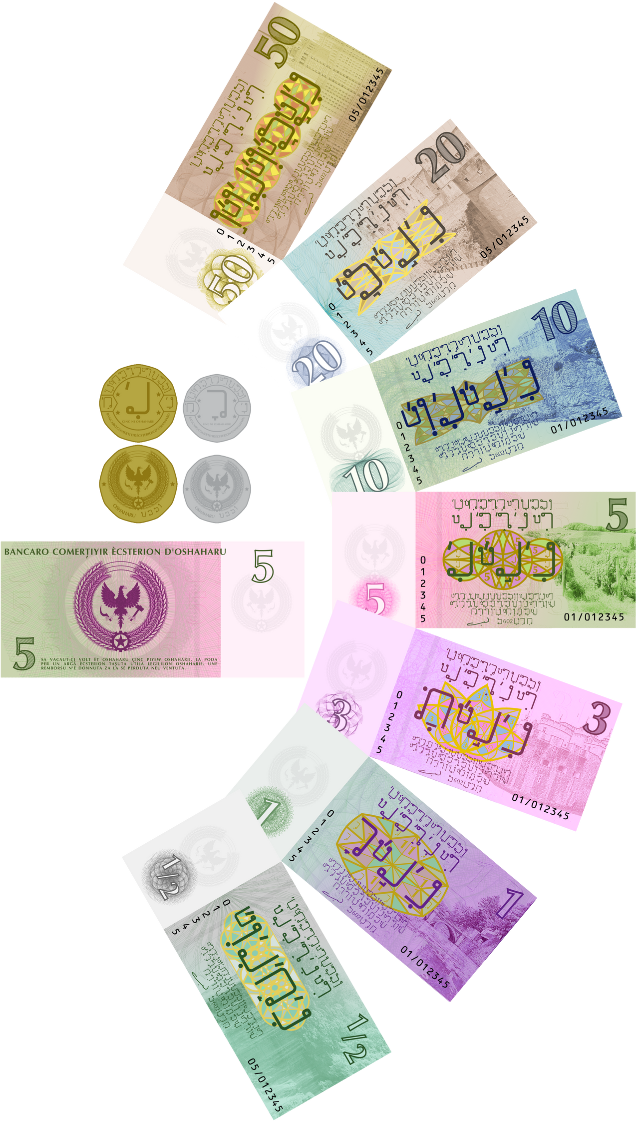
These are from Oshaharu, but they aren't proper banknotes: they're foreign exchange certificates, akin to the GDR's "Forum Check" and Cuba's "peso convertible". (Still illegal to export from the country, but these can be more readily converted back into foreign currency. They also can, theoretically, only be acquired with foreign currency, so many ordinary Oshaharu will not encounter them, plus ordinary citizens holding them is a bit risky and can invite probing questions and interrogation.)
Re: Conlang Random Thread
Posted: Fri Aug 09, 2019 4:55 pm
by vegfarandi
What do you call the chapter about comparison, questions and negation? Is there a term that encompasses the three?
Re: Conlang Random Thread
Posted: Fri Aug 09, 2019 7:15 pm
by bradrn
vampireshark wrote: ↑Fri Aug 09, 2019 4:53 pm
A while ago, I made some money. Now that step one of thesis doom is out of the way, I figured sharing was in order.
These are from Oshaharu, but they aren't proper banknotes: they're foreign exchange certificates, akin to the GDR's "Forum Check" and Cuba's "peso convertible". (Still illegal to export from the country, but these can be more readily converted back into foreign currency. They also can, theoretically, only be acquired with foreign currency, so many ordinary Oshaharu will not encounter them, plus ordinary citizens holding them is a bit risky and can invite probing questions and interrogation.)
Those look amazing! I particularly like the design of the script — do you have a reference anywhere?
vegfarandi wrote: ↑Fri Aug 09, 2019 4:55 pm
What do you call the chapter about comparison, questions and negation? Is there a term that encompasses the three?
I don’t believe there’s a term encompassing those topics which is any more specific than ‘syntax’. But I can’t see anything in particular which those topics would have in common, so I can’t see the need for a common name.
Re: Conlang Random Thread
Posted: Sat Aug 10, 2019 6:40 pm
by masako
jal wrote: ↑Fri Aug 02, 2019 2:51 pm
Very nice script

.
Thank you very much.
Re: Conlang Random Thread
Posted: Sat Aug 10, 2019 7:04 pm
by doctor shark
bradrn wrote: ↑Fri Aug 09, 2019 7:15 pm
Those look amazing! I particularly like the design of the script — do you have a reference anywhere?
Thanks! And I may have one somewhere, but it's probably old... if I get the chance, I'll try to do up a small thing on the language and the script.
Re: Conlang Random Thread
Posted: Fri Aug 16, 2019 11:03 am
by Salmoneus
A dream I had insisted that the word for "twenty" in a romance language should be "fusta".
When I, half-awake, considered this, I realised that it actually wasn't impossible.
There would seem to be two obvious routes from "viginti" to "fusta". Both of them require devoicing the initial fricative (not unreasonable). Then either:
fuginti > fuints (loss of medial /g/ and final non-/a/ vowels, both as in Gallo-Romance; final /i/ palatalises/affricates preceding alveolar as in Eastern and Rhaeto-Romance)
fuints > funsta (addition of prop vowel after cluster that merges with /a/ (still GR); reduction of diphthong; metathesis to match sonoracy hierarchy)
funsta > fusta (loss of nasals before fricatives)
Or:
fuginti > fuGnti (loss of unstressed vowel)
fuGnti > fuGt (loss of final vowel, loss of cluster-internal /n/)
fuGt > fuxta (devoicing, prop vowel)
fuxta > fusta (assimilation)
The latter maybe seems simpler in abstract terms, but the former is closer to the usual path of Romance languages.
It's weird, but probably no weirder than Aromanian's "viginti > yinghits" thing.
Anyway, I don't think I'll do anything with any of this, but for some reason I wanted to get the thought down on 'paper'...
Re: Conlang Random Thread
Posted: Fri Aug 16, 2019 11:20 am
by Pabappa
I like it.
With regard to Aromanian, i think they palatalized even the labials before any /i/, so that's the /w/>/j/ (or maybe it was /v/>/j/), and then /t/ palatalised to /ts/. <gh> is just a spelling convention for /g/, though Im not sure why that didnt also palatalize. or maybe it just means /g_j/ when before an /i/?.... then the /n/ .... i think that may have been intrusive already in vulgar latin, since it appears in Spanish, which is very far from Romania.
Re: Conlang Random Thread
Posted: Sat Aug 17, 2019 8:08 am
by masako
Amal conlang
Gonna be using this instead of Frathwiki for Amal...easier to access, nicer format, etc.
Re: Conlang Random Thread
Posted: Sat Aug 17, 2019 7:28 pm
by Nortaneous
Salmoneus wrote: ↑Fri Aug 16, 2019 11:03 am
There would seem to be two obvious routes from "viginti" to "fusta". Both of them require devoicing the initial fricative (not unreasonable).
wiginti
wuginti
udʒintsə
uʒintsə
uʃintsə
u̥xintsə
xʷintsə
funtsə
fũtsə
fusta
(not sure about *ts > st; *st > ts is attested in NEC, but NEC *st already patterned as a unit. if not, wiginti > wuginti > udʒɨnʲtʲə > uʒɨ̃tʲə > uʃɨ̃jtə > u̥xɨʃtə > xʷuʃtə > fusta. for devoicing. cf. AmE [w̥ɪ̥tʃ-ˈwʌn] for "which one")
Re: Conlang Random Thread
Posted: Sat Aug 17, 2019 8:55 pm
by malloc
- redscript_sample_large.png (32.02 KiB) Viewed 12461 times
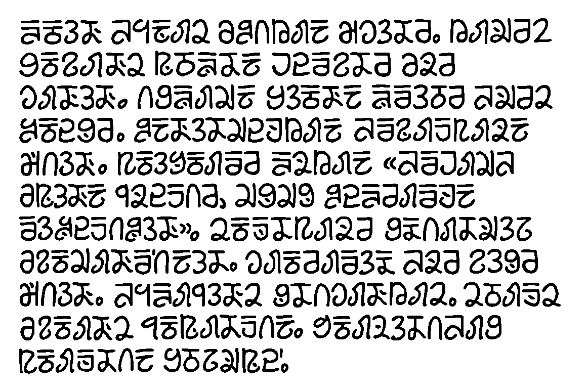
Another sample of the script (unrelated to the fragmentary angular one I previously posted) for my conlang with various random sentences arranged into a paragraph. Something about the overbar and dot (which represent featural distinctions beyond the base shape of each character) really bugs me both aesthetically and conceptually. It seems like each character ought to have a unified form without needing diacritics to write native phonological contrasts. Yet it has proven remarkably difficult for me to find alternatives that look good and have the same flexibility. Additionally some featural contrasts involve rotating or rearranging elements in ways that are rather abstract and opaque. Punctuation remains unsettled as well with the current sample borrowing on Western punctuation for the time being.
Re: Conlang Random Thread
Posted: Sat Aug 17, 2019 9:46 pm
by Pabappa
I share your dislike of the overbars and dots, and i feel the same way even when i see them in natlangs .... at least when they cause the characters they modify to shrink. in the Roman alphabet all five vowels are short, so the diacritics can ride on top without sticking up above the writing line (except when writing in capitals). but e.g. the ú in
this logo is ugly to me.
i cant really help, .... i spent a lot of time on a conscript that had tall and short letters just like the Roman alphabet, where the short letters all had "shields" around them so that theyd appear full height instead of looking like they had diacritics on, but I dont think a system like that would adapt well to a featural conscript.
wait, what about replacing the overbar with a diagonal line through the roundest part of each letter? and maybe the dot with a diagonal line the other way?
Re: Conlang Random Thread
Posted: Sun Aug 18, 2019 4:36 am
by Nortaneous
malloc wrote: ↑Sat Aug 17, 2019 8:55 pm
It seems like each character ought to have a unified form without needing diacritics to write native phonological contrasts.
The Nuosu falling tone is written with a diacritic on the corresponding mid-tone character in the native script.
Pahawh Hmong is full of diacritics, which were originally unsystematic.
Canadian syllabics uses a diacritic to mark vowel length.
Re: Conlang Random Thread
Posted: Sun Aug 18, 2019 2:59 pm
by Qwynegold
malloc wrote: ↑Sat Aug 17, 2019 8:55 pmSomething about the overbar and dot (which represent featural distinctions beyond the base shape of each character) really bugs me both aesthetically and conceptually.
I think they're fine. Without them the script would lose its distinct flair.
Re: Conlang Random Thread
Posted: Mon Aug 19, 2019 7:50 am
by alynnidalar
malloc wrote: ↑Sat Aug 17, 2019 8:55 pm
Something about the overbar and dot (which represent featural distinctions beyond the base shape of each character) really bugs me both aesthetically and conceptually.
On the contrary, I personally love the aesthetics the overbar gives it! I was just thinking how pleasant the whole thing looks.
Re: Conlang Random Thread
Posted: Mon Aug 19, 2019 12:05 pm
by Raphael
malloc: as someone who doesn't know that much about conlanging, I think your script simply looks nice. That's what I think in an "I don't know art, but I know what I like" way.