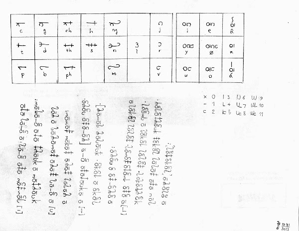
I think evmdbm wasn't asking about the the featural side of Moya and Omyatloko, but rather was asking about how easily the vowel marks are distinguished in Moya (regardless of whether these are featural or not).masako wrote: ↑Wed Jan 29, 2020 7:38 pmSo, if you're asking how natural the Kala glyphs are...they're not...but neither is Hangul (despite all the hype about the formation of the mouth correlating to the vowel symbols). The commonality of these types of 'sets of features' is fairly rare, but that doesn't mean you use a similar system.evmdbm wrote: ↑Tue Jan 28, 2020 6:59 am I was looking at the glyphs for Kala, partly because I'm still mucking around with letter forms for my alphabet for Vedreki and Cheyadeneen. The vowels all seem quite similar. They all have the same vertical stroke and get differentiated by marks top and bottom. But even those look similar - big dashes and little dashes and different numbers of dashes. Is this common, because I'm trying to keep my letters fairly different in form so they're easily recognisable and distinguishable?
However, I am in fact interested in featural scripts. I just wanted to mention that the term featural means that a script modifies letters in a consistent way according to phonological features, like ±voice, ±aspiration, etc.; they don't have to resemble anatomy. For example, imagine a script where <b u ʁ> represent voiced /b d g/, and upside-down <p n ʀ> represent voiceless /p t k/.
I also think Hangeul well deserves its hype. The idea of grabbing the /p t s k l/ letters of 'Phags-pa (plus a novel null ㅇ), then simplifying them into anatomically-relevant shapes, and then creating a beautiful featural script around them is simply amazing. Top-grade work, especially so for a conscript supported by a medieval government (compare the infamous reform to the Latin script that was originally proposed for Kazakh, which has now been thankfully addressed).


