Experiments in Verdurian lettering

Almea and the Incatena
bradrn
Posts: 6257
Joined: Fri Oct 19, 2018 1:25 am

Experiments in Verdurian lettering

Post by bradrn »

(Apologies if this is in conflict with anything covered in Almea+400; I don’t have a subscription so wouldn’t know.)

In an idle moment recently, I happened to wonder… what might some alternate styles of Verdurian script look like, beyond the reference typeface used in the reference grammar? After a couple of abortive attempts with pen, paper, and vector editor, I ended up digging out an old calligraphy set of mine and playing around with Verdurian lettering. The results were quite interesting.

Before presenting them, my thoughts so far on Verdurian letterforms:
  • I’m not quite sure what writing instrument the reference face is derived from. The fluidity and thickness of the letters suggests a brush, but the angled ends of many strokes look more like the result of a broad-edge nib. I went with the latter for my lettering, mostly because I can’t find my brush — if I ever had one in the first place, which I suspect I didn’t.
    (In fact, I strongly suspect they were actually drawn with that most versatile of tools, the Adobe calligraphy tool with Wacom tablet. Alas, such refined instruments were not available to the Old Verdurians, so I must look for other possibilities…)
  • The construction principles of lowercase Verdurian letters seem quite different to that of Latin letters. Most importantly, Verdurian letters tend to have fluid forms with many twists and turns: the midline is much more important in Verdurian than in Latin. On the other hand, Verdurian letters tend to be uniform in height, whereas Latin has many more ascenders and descenders. I thus suspect that (in Latin terms) most Verdurian type will have a large x-height.
  • Two letters pose particular difficulties for the type designer. In the reference face, a has lots of detail compressed into the top, counterbalanced by a big swash unlike any other letter. An even trickier one is la: it has a completely different aspect ratio to the other letters, with big unused spaces on the top and bottom. Furthermore, it is liable to be confused with the comma. I suspect Verdurian designers would have lots of fun experimenting with these letters (as indeed have I).
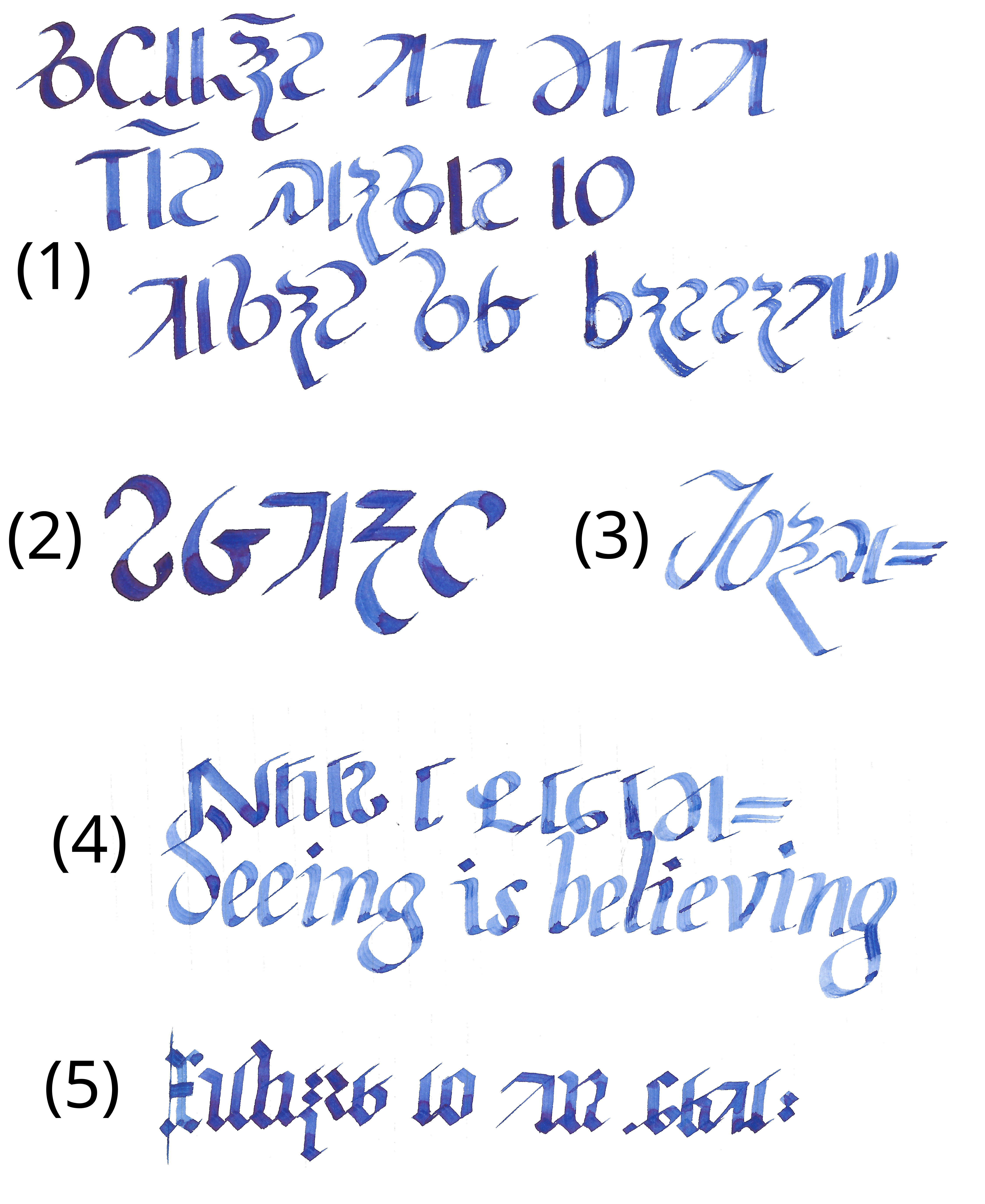
Anyway, without further ado, my attempts at Verdurian calligraphy (plus a little English):

Image

Clearly I’m not going to win any calligraphy awards any time soon. Oh well, maybe I’ll improve with practise. (For bonus points, try to find the spelling error!)

In numbered order: (1) here is an attempt at a fairly standard and formal script. The text is that on the web LCK front page, just not in cursive. (Incidentally, that’s already given me some ideas on how to simplify the letters, though none of that made it into any of these examples.) Next, (2) is an attempt at a different stress angle, which I thought came out remarkably well. (3) is more italic-inspired; it came out nice and fluid, if a bit wonky. (4) was an attempt to integrate Verdurian and English: individually, I’m happy with the results, but I’m not entirely convinced that they work together. Finally, (5) is a (somewhat inconsistent) blackletter, a style which works surprisingly well with Verdurian considering that the two are totally unrelated.

So: all in all, I’m largely happy with the results, though most of them could do with some refinement. They definitely suggest some possibilities for different Verdurian typeface styles. What does everyone else think?
Last edited by bradrn on Sun Sep 10, 2023 8:51 am, edited 1 time in total.
Conlangs: Scratchpad | Texts | antilanguage
Software: See http://bradrn.com/projects.html
Other: Ergativity for Novices

(Why does phpBB not let me add >5 links here?)
User avatar
Raphael
Posts: 4552
Joined: Sun Jul 22, 2018 6:36 am

Re: Experiments in Verdurian lettering

Post by Raphael »

Pretty!

This reminds me, what I find interesting when seeing Verdurian writing is that some of it looks similar enough to the Latin alphabet that my brain instantly jumps to trying to figure out which Latin letters those are supposed to be.
bradrn
Posts: 6257
Joined: Fri Oct 19, 2018 1:25 am

Re: Experiments in Verdurian lettering

Post by bradrn »

Raphael wrote: Sat Sep 09, 2023 9:58 am Pretty!
Thanks!
This reminds me, what I find interesting when seeing Verdurian writing is that some of it looks similar enough to the Latin alphabet that my brain instantly jumps to trying to figure out which Latin letters those are supposed to be.
I get that too. Mind you, I sometimes get this feeling with natlang scripts as well, although the only one I can think of right now is Armenian.
Conlangs: Scratchpad | Texts | antilanguage
Software: See http://bradrn.com/projects.html
Other: Ergativity for Novices

(Why does phpBB not let me add >5 links here?)
zompist
Site Admin
Posts: 2944
Joined: Sun Jul 08, 2018 5:46 am
Location: Right here, probably
Contact:

Re: Experiments in Verdurian lettering

Post by zompist »

bradrn wrote: Sat Sep 09, 2023 9:43 am [*] I’m not quite sure what writing instrument the reference face is derived from. The fluidity and thickness of the letters suggests a brush, but the angled ends of many strokes look more like the result of a broad-edge nib. I went with the latter for my lettering, mostly because I can’t find my brush — if I ever had one in the first place, which I suspect I didn’t.
(In fact, I strongly suspect they were actually drawn with that most versatile of tools, the Adobe calligraphy tool with Wacom tablet. Alas, such refined instruments were not available to the Old Verdurians, so I must look for other possibilities…)
The font I use is of course a printed font (made with Fontographer and its derivatives). But it's highly influenced by my own calligraphy— I still have my Speedball pens, though I don't have any ink for them. I looked around a bit but couldn't find any examples; they're in old folders somewhere.
In the reference face, a has lots of detail compressed into the top, counterbalanced by a big swash unlike any other letter.
In calligraphy you're supposed to have some fun with that swash. Also with the lowercase n, which often ends a word; in the sample here you can see some examples. A final -n ends up as a sort of swash curving up over the top of the word.
An even trickier one is la: it has a completely different aspect ratio to the other letters, with big unused spaces on the top and bottom.
Yep— I like to draw it out to double length or so.
Furthermore, it is liable to be confused with the comma.
It shouldn't be; the comma should be nearly straight, the lowercase L distinctly curved, like a tilde.
Anyway, without further ado, my attempts at Verdurian calligraphy (plus a little English). Clearly I’m not going to win any calligraphy awards any time soon. Oh well, maybe I’ll improve with practise. (For bonus points, try to find the spelling error!)
Very nice— I'd remark you do get better as you go; the later <a>'s look better.

(2) is a nice variation.

For (5) you might take a look at Barakhinei, which starts with the Cadhinor letters and adds decorations.

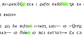
For fun I append something from Almea+400, a soft drink logo (Konaci) from the 3630s.
Attachments
konaci.png
konaci.png (46.91 KiB) Viewed 4652 times
bradrn
Posts: 6257
Joined: Fri Oct 19, 2018 1:25 am

Re: Experiments in Verdurian lettering

Post by bradrn »

zompist wrote: Sun Sep 10, 2023 7:36 am I still have my Speedball pens, though I don't have any ink for them.
Oh, the same brand I’m using! Alas, the inks that came with mine have long since evaporated, but I found the inks I use with my fountain pen work just as well.
Also with the lowercase n, which often ends a word; in the sample here you can see some examples. A final -n ends up as a sort of swash curving up over the top of the word.
I did in fact notice that! Unfortunately too late to properly make it into that image, but if you look at the last line of (1) I at least made a feeble attempt to incorporate something similar. I’ve been playing around with Verdurian handwriting today, and I’ve tried to be more consistent with final -n.

(Cursive handwriting is interesting, incidentally… if that sample is any guide, it feels like Verdurian handwriting should have a similar approach to, say, Nastaʿlīq, where the start of each letter directly follows on from the end of the previous one. But of course I don’t know how close that sample is to ordinary handwriting, except insofar as calligraphy usually reflects general handwritten style. Can you comment?)
Furthermore, it is liable to be confused with the comma.
It shouldn't be; the comma should be nearly straight, the lowercase L distinctly curved, like a tilde.
Indeed, which is why I tried to make its swash really distinct in my samples. (Sometimes to extreme lengths, as in (4).) I suspect handwritten text would also tend to exaggerate the swash. But I feel that in the reference font it’s subtle enough that it becomes easy to miss — e.g. from the grammar:

Image
Anyway, without further ado, my attempts at Verdurian calligraphy (plus a little English). Clearly I’m not going to win any calligraphy awards any time soon. Oh well, maybe I’ll improve with practise. (For bonus points, try to find the spelling error!)
Very nice— I'd remark you do get better as you go; the later <a>'s look better.
The image isn’t actually the order I wrote them in. I did (1) last!
(2) is a nice variation.
Yeah, that one came out really well. I’m honestly not sure how it ended up so good; in fact, I tried to replicate it a couple of times and failed.
For (5) you might take a look at Barakhinei, which starts with the Cadhinor letters and adds decorations.
Thanks for the pointer! Barakhinei definitely isn’t blackletter, but I can see the similarities.
For fun I append something from Almea+400, a soft drink logo (Konaci) from the 3630s.
Oh, very nice!

In turn, when I first started this, I attempted to design an Almea+400 logo-esque thing, to experiment with some weirder possibilities:

Image

Looking back on it, the ⟨l⟩ feels a bit distressed, and I didn’t experiment with the ⟨a⟩ enough. But I think the principle was sound.
Last edited by bradrn on Sun Sep 10, 2023 9:34 am, edited 1 time in total.
Conlangs: Scratchpad | Texts | antilanguage
Software: See http://bradrn.com/projects.html
Other: Ergativity for Novices

(Why does phpBB not let me add >5 links here?)
User avatar
Ketsuban
Posts: 177
Joined: Tue Nov 13, 2018 6:10 pm

Re: Experiments in Verdurian lettering

Post by Ketsuban »

The whole bradrn.com site isn't working for me unless I deliberately use HTTP instead of HTTPS.
bradrn
Posts: 6257
Joined: Fri Oct 19, 2018 1:25 am

Re: Experiments in Verdurian lettering

Post by bradrn »

Ketsuban wrote: Sun Sep 10, 2023 9:32 am The whole bradrn.com site isn't working for me unless I deliberately use HTTP instead of HTTPS.
Yes, I haven’t bothered to set up HTTPS for it. The image links should all be over HTTP, though, unless I made a typo somewhere.
Conlangs: Scratchpad | Texts | antilanguage
Software: See http://bradrn.com/projects.html
Other: Ergativity for Novices

(Why does phpBB not let me add >5 links here?)
User avatar
foxcatdog
Posts: 1662
Joined: Fri Nov 15, 2019 7:49 pm

Re: Experiments in Verdurian lettering

Post by foxcatdog »

Bradrn uses linux and it seems a common theme of linux things not working on every machine. At least this is what i have ascertained from memes about them.
bradrn
Posts: 6257
Joined: Fri Oct 19, 2018 1:25 am

Re: Experiments in Verdurian lettering

Post by bradrn »

foxcatdog wrote: Sun Sep 10, 2023 6:47 pm Bradrn uses linux and it seems a common theme of linux things not working on every machine. At least this is what i have ascertained from memes about them.
Practically none of this is correct, except the bare fact that I use Linux:
  • First of all, my webserver is a separate machine from my usual computer. (Otherwise the images would go away every time I shut down my computer.)
  • The server does happen to use Linux as well, but that’s far from unusual: a large majority of websites are hosted on Linux, probably including this very one. (Also Wikipedia, Google, YouTube, Amazon, Netflix, even Microsoft…)
  • In any case, the OS of the server has practically no impact whatsoever on your experience, once it’s set up right. Your computer communicates with my server over the same channels it communicates with everything else. My server doesn’t even know what your machine is, so there’s no way it could ‘not work’ on your machine specifically unless something is wrong on your side.
  • For completeness, I must mention that some things do occasionally fail to work on my usual computer… but it’s very rare, even though I use a bleeding-edge distribution. And in my experience, there’s plenty of Windows things too which don’t work on every machine.
  • The only reason people have failed to connect to my website is when they’ve accidentally used HTTPS rather than HTTP. (Or when I’ve accidentally given them an HTTPS link.) HTTPS is more secure, but I consider that irrelevant for my needs and the size of my website, which is why I haven’t bothered to set it up.
Conlangs: Scratchpad | Texts | antilanguage
Software: See http://bradrn.com/projects.html
Other: Ergativity for Novices

(Why does phpBB not let me add >5 links here?)
User avatar
foxcatdog
Posts: 1662
Joined: Fri Nov 15, 2019 7:49 pm

Re: Experiments in Verdurian lettering

Post by foxcatdog »

Thanks for the education i will now tell my mom how most websites run on linux.
bradrn
Posts: 6257
Joined: Fri Oct 19, 2018 1:25 am

Re: Experiments in Verdurian lettering

Post by bradrn »

I found another fine example of zompist’s Verdurian calligraphy: http://zompist.com/lord.htm. This confirms some of my hypotheses about certain letters, in particular the handwritten forms of uppercase ⟨S⟩ and lowercase ⟨o⟩.
Conlangs: Scratchpad | Texts | antilanguage
Software: See http://bradrn.com/projects.html
Other: Ergativity for Novices

(Why does phpBB not let me add >5 links here?)
Civil War Bugle
Posts: 61
Joined: Sat Jul 14, 2018 6:57 pm

Re: Experiments in Verdurian lettering

Post by Civil War Bugle »

I like the blackletter font, although I feel like I will like any blackletter font adapted to other scripts.

I noticed after following the link to the Lord of News page that apparently my browser isn't displaying the Verdurian font there. A couple of the links for font sources seem to be dead links, does anyone know if GNU Unifont (or any other source) has Linux-compatible installable Verdurian fonts?

(I would dig deeper except that I'm about to do work and I wanted to toss the question out before I forget about it.)
bradrn
Posts: 6257
Joined: Fri Oct 19, 2018 1:25 am

Re: Experiments in Verdurian lettering

Post by bradrn »

Civil War Bugle wrote: Tue Sep 12, 2023 6:35 am I like the blackletter font, although I feel like I will like any blackletter font adapted to other scripts.
Thanks — but it’s not a font! It’s hand-lettering. (I’ve become very pedantic about these things lately… not that I ever wasn’t, mind you.)
I noticed after following the link to the Lord of News page that apparently my browser isn't displaying the Verdurian font there.
Neither does mine. That’s why it has a link to the Verdurian fonts. (http://zompist.com/embassy.htm#csur — I believe that page requires verdurian.ttf. I’m not sure why it doesn’t use the same webfont as the Reference Grammar.)
Conlangs: Scratchpad | Texts | antilanguage
Software: See http://bradrn.com/projects.html
Other: Ergativity for Novices

(Why does phpBB not let me add >5 links here?)
zompist
Site Admin
Posts: 2944
Joined: Sun Jul 08, 2018 5:46 am
Location: Right here, probably
Contact:

Re: Experiments in Verdurian lettering

Post by zompist »

Civil War Bugle wrote: Tue Sep 12, 2023 6:35 am I like the blackletter font, although I feel like I will like any blackletter font adapted to other scripts.

I noticed after following the link to the Lord of News page that apparently my browser isn't displaying the Verdurian font there. A couple of the links for font sources seem to be dead links, does anyone know if GNU Unifont (or any other source) has Linux-compatible installable Verdurian fonts?
Oh, I should just change that page to use the regular Verdurian font, which will display correctly for everyone.

(That's also the answer to Brad's question. The Lord of News page is very old, before I learned how to use CSS to force the browser to load a font.)

(I also need to get an updated font program... I need to add some extra letters and symbols.)
bradrn
Posts: 6257
Joined: Fri Oct 19, 2018 1:25 am

Re: Experiments in Verdurian lettering

Post by bradrn »

zompist wrote: Tue Sep 12, 2023 6:51 am (I also need to get an updated font program... I need to add some extra letters and symbols.)
If you need something free, then I’ve found FontForge to be quite usable, despite the ugly UI. (Though I know there’s others you’ve used before — I mention it merely out of completeness.)
Conlangs: Scratchpad | Texts | antilanguage
Software: See http://bradrn.com/projects.html
Other: Ergativity for Novices

(Why does phpBB not let me add >5 links here?)
zompist
Site Admin
Posts: 2944
Joined: Sun Jul 08, 2018 5:46 am
Location: Right here, probably
Contact:

Re: Experiments in Verdurian lettering

Post by zompist »

bradrn wrote: Tue Sep 12, 2023 6:55 am
zompist wrote: Tue Sep 12, 2023 6:51 am (I also need to get an updated font program... I need to add some extra letters and symbols.)
If you need something free, then I’ve found FontForge to be quite usable, despite the ugly UI. (Though I know there’s others you’ve used before — I mention it merely out of completeness.)
Thanks, but I think I can use TypeTool 3, which I can afford. :) It's compatible with the raw files I already have.
zompist
Site Admin
Posts: 2944
Joined: Sun Jul 08, 2018 5:46 am
Location: Right here, probably
Contact:

Re: Experiments in Verdurian lettering

Post by zompist »

I updated the Lord of News page. It should now properly display the Verdurian script. I've also updated some geographical names, and added the fifth story, which was not previously available in English.
bradrn
Posts: 6257
Joined: Fri Oct 19, 2018 1:25 am

Re: Experiments in Verdurian lettering

Post by bradrn »

Incidental note: after the requests above I decided to try get HTTPS to work on my webserver. Unfortunately, something broke, and now none of the images are visible. I’ll try to get it working again as quickly as possible.
zompist wrote: Wed Sep 13, 2023 12:39 am I updated the Lord of News page. It should now properly display the Verdurian script. I've also updated some geographical names, and added the fifth story, which was not previously available in English.
Great! Can confirm it works for me (after force-refreshing, of course).
Conlangs: Scratchpad | Texts | antilanguage
Software: See http://bradrn.com/projects.html
Other: Ergativity for Novices

(Why does phpBB not let me add >5 links here?)
Civil War Bugle
Posts: 61
Joined: Sat Jul 14, 2018 6:57 pm

Re: Experiments in Verdurian lettering

Post by Civil War Bugle »

bradrn wrote: Tue Sep 12, 2023 6:42 am
Civil War Bugle wrote: Tue Sep 12, 2023 6:35 am I like the blackletter font, although I feel like I will like any blackletter font adapted to other scripts.
Thanks — but it’s not a font! It’s hand-lettering. (I’ve become very pedantic about these things lately… not that I ever wasn’t, mind you.)
I noticed after following the link to the Lord of News page that apparently my browser isn't displaying the Verdurian font there.
Neither does mine. That’s why it has a link to the Verdurian fonts. (http://zompist.com/embassy.htm#csur — I believe that page requires verdurian.ttf. I’m not sure why it doesn’t use the same webfont as the Reference Grammar.)
Yeah, I probably should be less loose with how I use words sometimes. And I guess I seem to have prompted the easiest fix for me, although it involved work for Mark... Thanks. I might have figured out a workaround but I was busier yesterday than I am today, haha.
bradrn
Posts: 6257
Joined: Fri Oct 19, 2018 1:25 am

Re: Experiments in Verdurian lettering

Post by bradrn »

Found yet another example of zompist’s handiwork, from the Secret History:

Image

I’m pleased to report that I could read this quite easily, almost without consulting the reference grammar (except for the first letter, which puzzled me for a bit).
Conlangs: Scratchpad | Texts | antilanguage
Software: See http://bradrn.com/projects.html
Other: Ergativity for Novices

(Why does phpBB not let me add >5 links here?)
Post Reply